Introducing Menu Maker: Uber Eats’ New Menu Management Tool
November 19, 2019 / Global
A restaurant’s menu is arguably its most important feature. When ordering online or via the app with Uber Eats, potential customers can’t peer in through a restaurant’s windows or smell the scents wafting from their kitchens, so digital menus become the de facto representations of restaurants’ personalities.
As the Restaurant Menu Engineering team, our goal is to ensure that every restaurant in the world can accurately represent their offerings on Uber Eats. This seemingly simple task is actually quite complex due to the sheer variety of restaurants that exist, from local bakeries and food trucks to large chains and grocery stores.
To simplify the Uber Eats experience for our restaurant-partners, we built Menu Maker, a web-based tool for seamlessly managing menus on the Uber Eats app. Menu Maker’s simple interface and advanced functionality provides restaurant-partners with great flexibility while protecting consumers from fraud. Uber employees also interact with Menu Maker to assist our restaurant-partners with building their menus.
From Menu 1.0 to Menu 2.0
Today’s Uber Eats menus look very different today than they did only a few years ago. In our previous iteration of the app, we built tools to interact with the original menu data model (referred to as Menu 1.0), including the following:
-
- Menu Editor: Our restaurant-partners used Menu Editor to adjust menus externally. Menu Editor had a minimalist UI that let restaurants make basic changes to their menu. While this tool was sufficient for many menu adjustments, such as updating prices, it could not accommodate other use cases, for instance, marking an item as “out of stock.”
- Telescope: Uber employees used Telescope, an internal UI that let us change virtually any aspect of our restaurant-partners’ menus.
In the context of Uber Eats, an “item” is a single product a customer can order. Often, menus repeat the same items. For example, a burger may appear as a stand-alone item, and also as part of a combo. Menu 1.0 suffered from several drawbacks regarding duplicate items, including the inability to:
-
- Reuse an item in multiple places on the menu. Each instance of the same item required new copies of that item, a tedious and confusing process. Additionally, restaurant-partners would also need to reproduce each copy’s metadata, such as the description, from the original item.
- Retrieve accurate metrics for an item. For example, if we wanted to know the total number of sales of a particular item that appeared multiple times on the same menu, we would need to add up the sales for each copy of that item.
- Mark each copy of an item “out of stock” whenever the restaurant-partner ran out of it, adding unnecessary time and effort to the process. If we missed any copies, our partners could potentially deliver incomplete orders, making our eaters unhappy.
On Menu 1.0, around 25 percent of all items on Uber Eats menus were duplicates.
In 2018, we rolled out Menu 2.0, our new menu data model that supports item sharing, resolving all of the above issues. It also provides a variety of other useful features Menu 1.0 lacked, such as a flexible pricing model for more complex menus.
Since there are many different applications across the Uber Eats platform, all of which were built to support Menu 1.0, migrating to Menu 2.0 wasn’t an easy task. In particular, both Menu Editor and Telescope contained business logic specific to Menu 1.0 that needed to be updated, including tools built with outdated software libraries and engineering patterns. With Menu 2.0, we embraced the change as an opportunity to develop with a mindset for growth and scalability in line with the continued expansion of the Uber Eats business, as it incorporated new markets, restaurants, and items.
With Menu 2.0, the structure of Uber Eats menus added a new set of fields and definitions for how relationships between fields were defined. Menu Editor and Telescope made it easier to interact with the Menu 1.0 data model, but Menu 2.0 required a new approach. To further streamline the Uber Eats menu data model, we created a single new tool called Menu Maker that merged elements of Menu Editor and Telescope, and let both Uber engineers and restaurant-partners manage menus.
Product overview
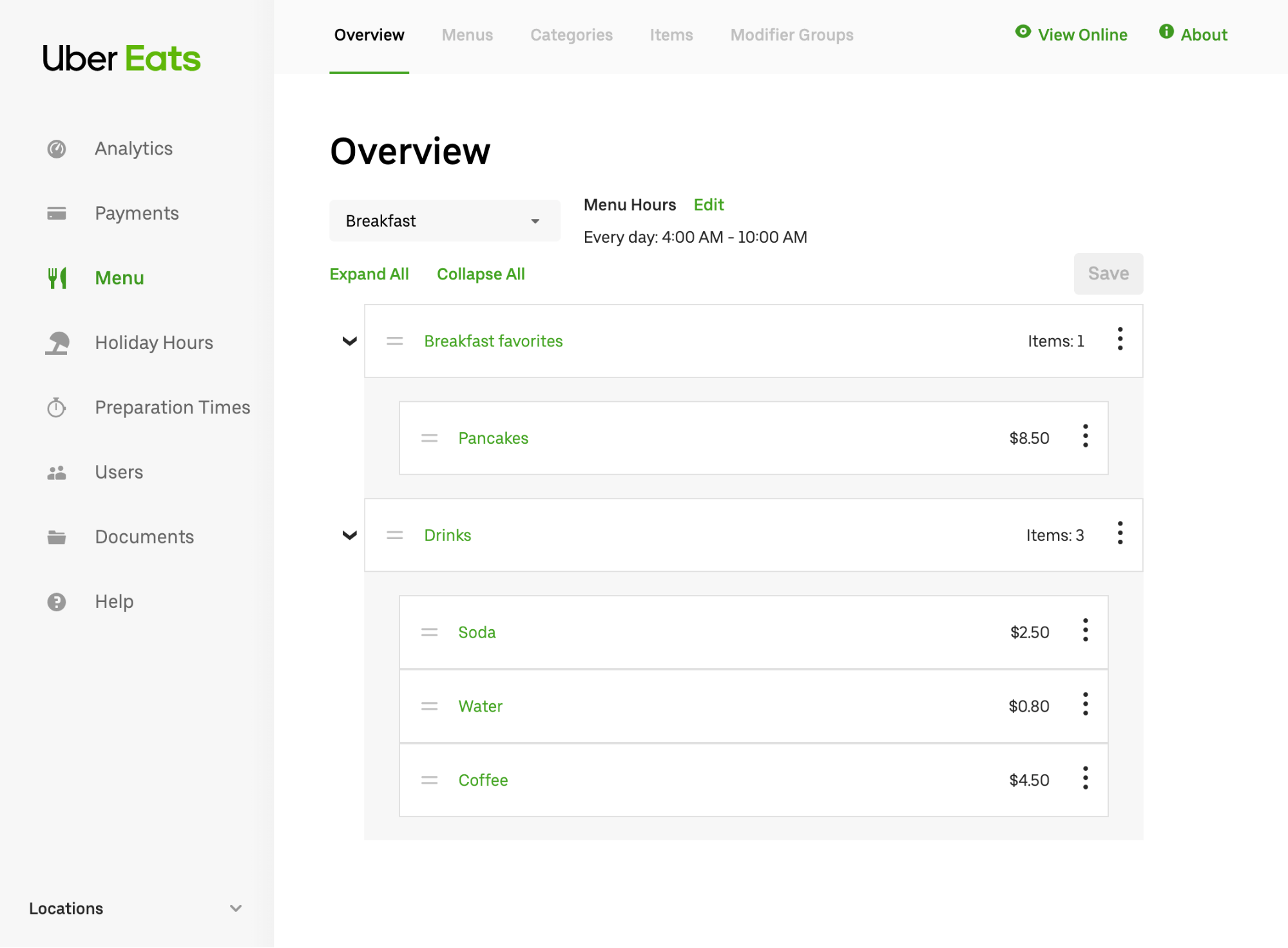
Menu Maker is a web-based tool that contains several pages, each with its own set of features and information. A navigation bar at the top provides a quick way to switch between pages, as displayed in Figure 1, below:
Much like a text document is made of discrete components such as headings and paragraphs, menus on Uber Eats are broken down into similarly discrete entities, such as items and categories, which represent the building blocks of the full menu. On Menu Maker, partners can view the entire list of entities for a particular type, as depicted in Figure 2, below:
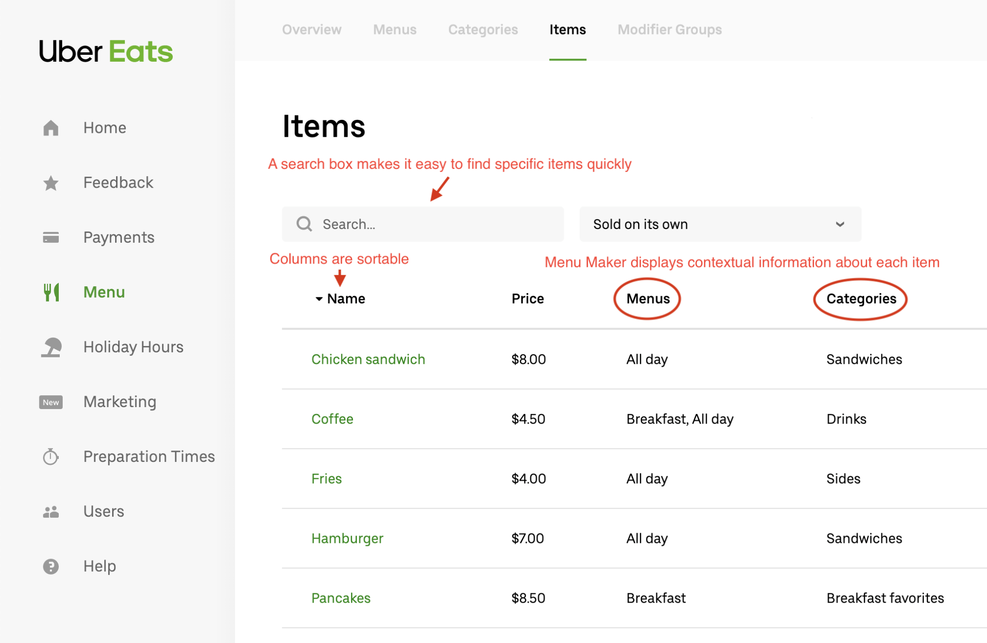
Viewing all entities of a particular type, such as prices or food categories, in one place makes it easy to quickly find the entity that the restaurant-partner wants to modify. The list of entities includes information about each entity that explains its context via description. For example, in the item list, the user can see which categories each item belongs to. Clicking the name of an entity brings the user to another page where they can edit, delete, or duplicate that entity.
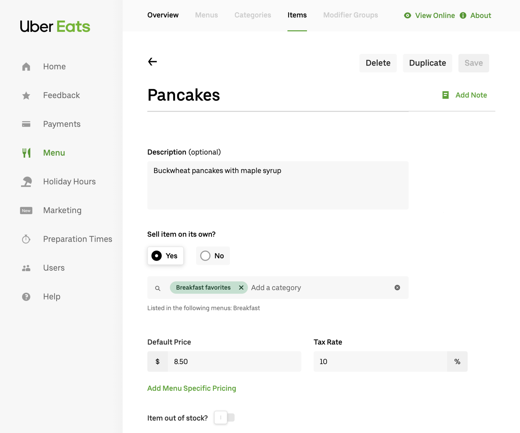
A specific entity’s page contains a web form with fields for all the properties users can modify. The form ensures that users’ inputted values are valid before saving them.
Most of the features we added to Menu Maker are straightforward and user-friendly. However, under the hood, we power these features with logic that facilitates even greater functionality. One such functionality is the ability to implement contextual overrides that enable entities to behave differently from each other depending on where they are placed in the menu.
Contextual overrides
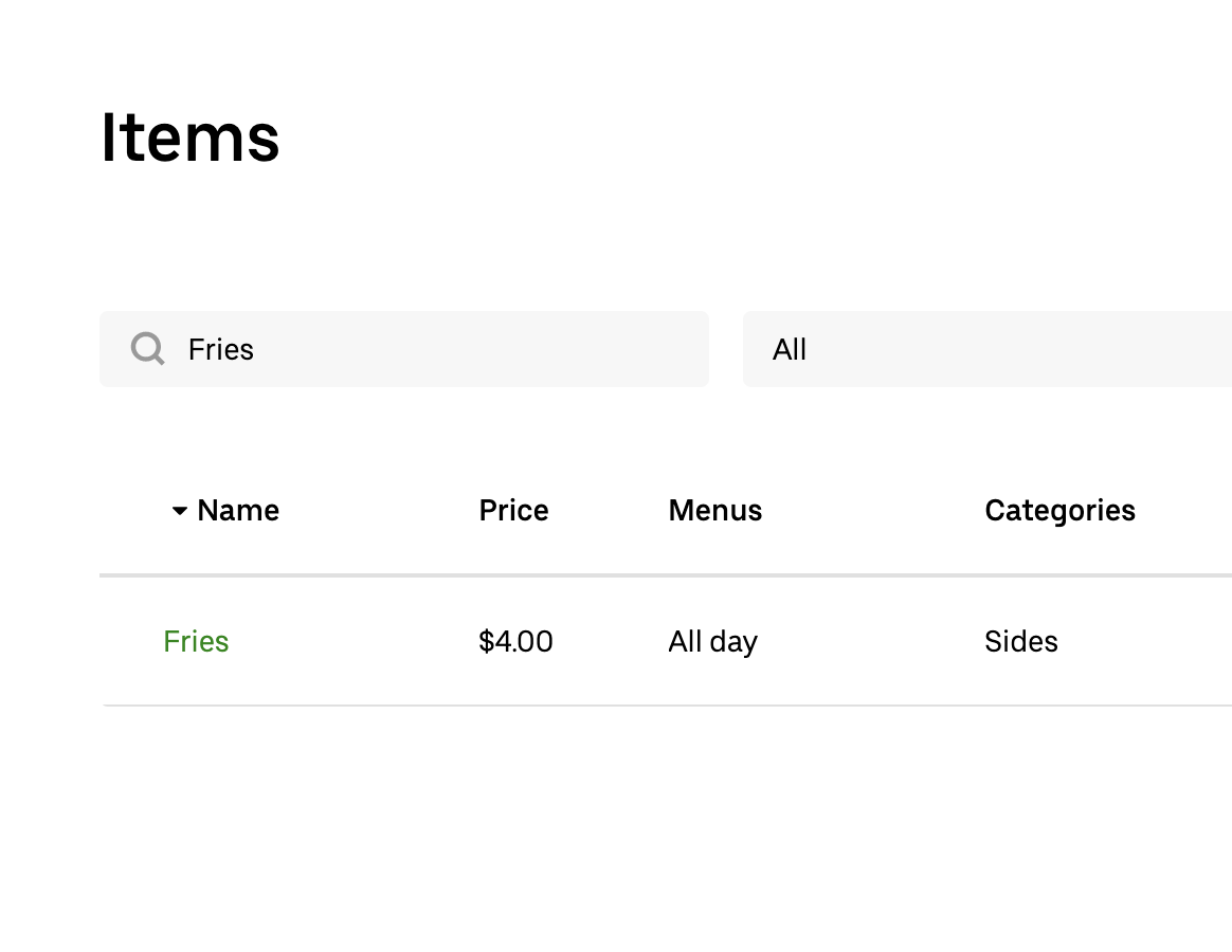
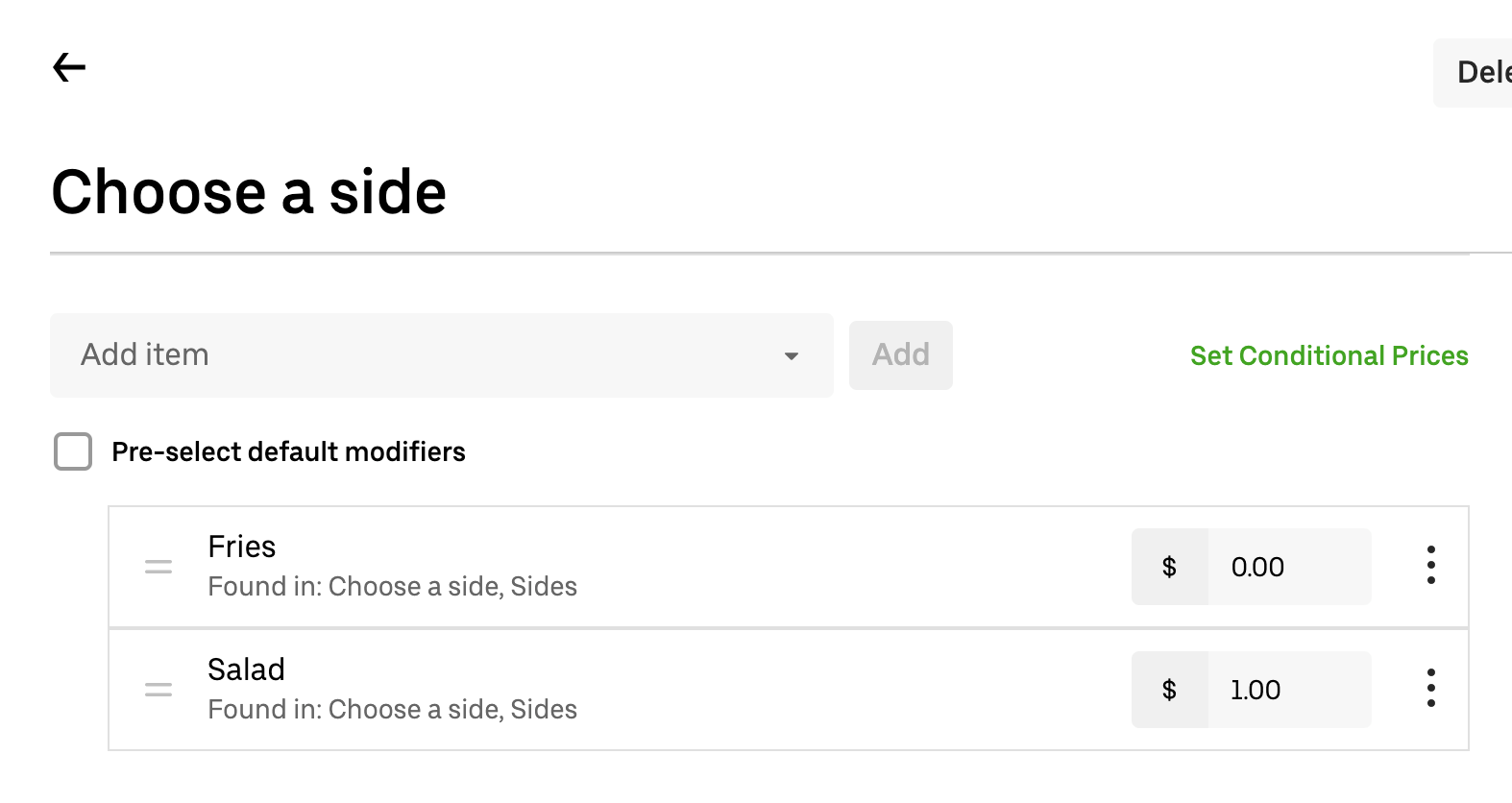
The inability to reuse the same item multiple times in our Menu 1.0 data model was problematic, leading to technical debt and unnecessary complexity. With contextual overrides, Menu Maker allows users to make prices overridable when a menu reuses a specific item. For instance, suppose that normally, a restaurant sells fries for $4.00 as a standalone item, but they’re free when sold as a side. In other words, depending on the context, fries can either cost $4.00 or $0.00, as depicted in Figures 4 and 5, below:
With Menu Maker, we can represent any field that is overridable using the flexible JSON format shown below:
Above, T represents a generic type that differs depending on what field the contextual override belongs to. For something like price, T would just be a number. For a different field, such as one that specifies hours of availability, T might be a structure containing dates and times.
Each entity has its own set of overridable fields, and the overrides only apply for that specific entity. Thus, the price field for our fries item might look like this:
Each override possesses a context in which the override becomes relevant. In the above example, the price is 0 when the item is used as an option for “Choose a side” (contextValue: ‘choose_side_uuid’). If a menu reuses an item in many places, this field could have a long list of multiple overrides.
Menu Maker manages contextual overrides behind the scenes, abstracting them away from the UI, and as a result, offering a seamless, functional Uber Eats menu that can easily accommodate duplicate items and is intuitive to create and maintain.
Reviewing menu changes
In order to ensure Uber Eats always delivers a quality product, we took measures to protect users when upgrading to Menu 2.0 and Menu Maker. To that end, we built countermeasures into Menu Maker to safeguard against bad actors on the platform.
Most changes to a menu in Menu Maker take effect immediately (for instance, the addition or subtraction of new items), but in certain cases, such as price changes, we temporarily flag changes for review before they go live. To simplify this process, we created a new system in Menu Maker to assess and approve price changes.
Specifically, when a restaurant-partner wants to change a price in Menu Maker, it must go through a series of specific approvals before we make the modification. First, the restaurant-partner has to submit a request to adjust the cost of an item, as depicted in Figure 6, below:
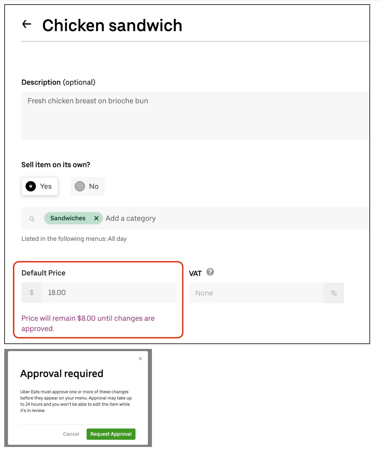
When a restaurant-partner has submitted a request to change a price, we consider the item price to be “pending.” Pending changes introduce a new class of challenges; when they’re in that state, there are two different sources of truth for an item: the “current” item and the “pending” item. Once our operations team approves the change, our back end overwrites the current item with the pending item. If more than one change is implemented at the same time, this overwriting process will clobber those changes, undoing them in the process. For example, if someone had changed the name of the item, the overwrite would revert the item to the old name.
Dealing with these issues is nontrivial; anyone who has worked with a version control system for software is likely familiar with the slew of edge cases involved. In the case of our pending changes, we grappled with questions such as: What happens if a price change gets approved for an item that has since been deleted? What price do we show in Menu Maker if there are multiple pending prices?
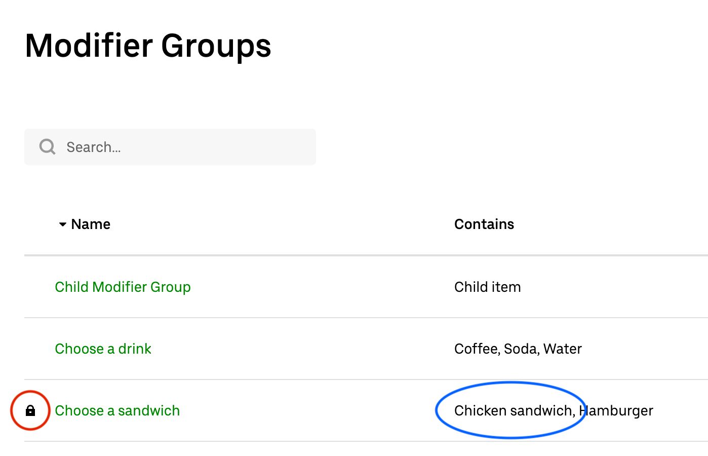
Instead of laboring over a solution that accounts for all these scenarios, we took a simpler approach: we lock pending items, preventing any further changes to them. Once the changes are approved or rejected, we allow Menu Maker to implement further item modifications.
This approach to version control reduces the problem space down to a more manageable size because it ensures that there are never multiple pending changes for the same item. Of course, we also need to lock any other entities dependent on the item, since those entities could influence the pending item’s contextual overrides.
In the below example, we have an item called “Chicken sandwich” that eaters see as an option under “Choose a sandwich.” If “Chicken sandwich” becomes locked due to pending changes, Menu Maker also locks “Choose a sandwich,” since there is a dependency relationship between them, as depicted in Figure 7, below:
Locking the dependent entities of items with pending changes allows us to avoid tricky edge cases and versioning issues that could disrupt our system, and in turn improves the experiences of our engineers, eaters, and restaurant partners on the app.
Rolling out Menu Maker
Once we were ready to share Menu Maker with the world, we needed to figure out how to roll it out in a non-disruptive way to restaurant-partners accustomed to our previous Uber Eats menu UI. In order to make the transition as smooth as possible, we looked to the rest of the Uber Eats restaurant tooling ecosystem for ideas.
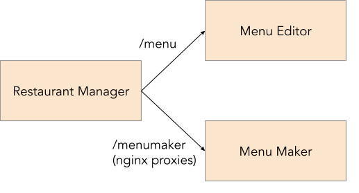
Restaurant Manager, Uber Eats’ web portal for restaurant-partners, is the gateway between our restaurant analytics, order summaries, and now, Menu Maker. We developed Menu Maker as a self-contained web application so we could leverage Fusion.js, Uber’s open source web framework, without needing to migrate the rest of Restaurant Manager, which ran on an older framework. This strategy meant that we now had two separate apps, Restaurant Manager and Menu Maker, and we needed to conditionally transition restaurants between them.
Leveraging NGINX, an open source web server that we use for reverse proxying, we could route users to the appropriate web application based on the URL. For example, nginx proxies all requests for URLs that begin with https://restaurant.uber.com to Restaurant Manager by default.
For this use case, we decided to proxy a specific URL within the same domain as Restaurant Manager to Menu Maker so that we could selectively roll it out by simply adjusting the Menu Editor link for certain restaurants, as depicted in Figure 8. This method was preferable to an all-at-once global rollout because it allowed us to focus on supporting one region at a time and quickly fix bugs during our beta launch.
Routing to different apps based on the URL made it much easier for us to keep the behavior of our systems consistent. In our testing environment, we maintained two separate apps, one for Restaurant Manager and one for Menu Maker. We were also able to use the exact same proxying strategy in the testing domain to switch between that domain’s version of the apps.
Our staged rollout strategy was a success; we were able to methodically roll out Menu Maker over time to all Uber Eats regions, allowing us to focus on each region’s specific issues or bugs as they surfaced.
Moving forward with Menu Maker
As with any large menu tooling system, building Menu Maker required a lot of creativity and flexibility, and encouraged us to explore alternative technical avenues. As we continue to bring Uber Eats to new markets and welcome more and more restaurant-partners to our platform, we are optimistic that our modular architecture and user-first approach to data model development will facilitate seamless growth and greater efficiency.
Acknowledgments
The Menu Maker project spanned many months and multiple organizations across Uber Eats; launching would never have been possible without the invaluable support of everyone involved. We had tremendous support from the engineering and product teams within the Uber Eats Restaurant organization throughout the process.

Paul Hou
Paul Hou is an engineer on Uber’s Eats’ Restaurant Menu team.
Posted by Paul Hou
Related articles
Most popular

A beginner’s guide to Uber vouchers for riders

Automating Efficiency of Go programs with Profile-Guided Optimizations

Enhancing Personalized CRM Communication with Contextual Bandit Strategies


