Visualizing Traffic Safety with Uber Movement Data and Kepler.gl
17 May 2019 / Global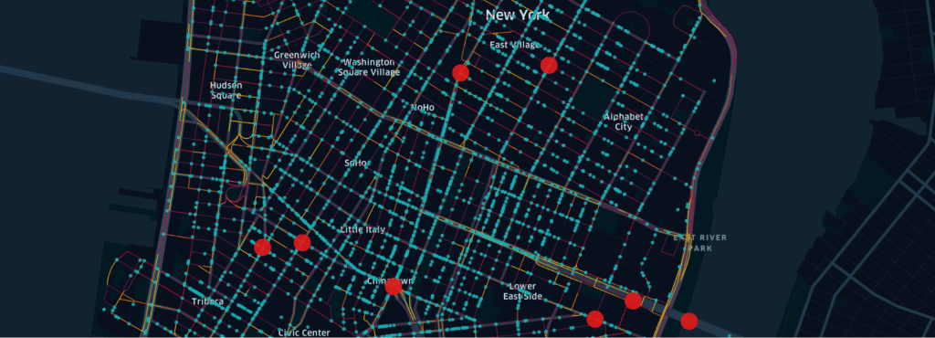
Urban traffic can be dangerous, a point known all too well by city dwellers and drivers. Discovering the most dangerous street locations in a city can help urban planners take steps to enhance safety through strategies such as lower speed limits or traffic rerouting.
Among its many uses, data visualization delivers the insights urban planners can use to better manage traffic in cities.
To demonstrate this power of data visualization, we offer a use case showing the most dangerous traffic locations in Manhattan. For this visualization, we leverage Kepler.gl, an open source data agnostic web-based application capable of exploring large-scale geolocation datasets, along with three datasets containing traffic information.
These datasets come from public and private sources, and offer different data-driven takes on traffic safety. The ability to derive useful insights from data visualization often comes from the ability to combine different data related to the same topic. Our use case will show how Kepler.gl makes it very easy to build a visualization from disparate datasets.
We conclude this article with a small step-by-step exercise on how to visualize data using Kepler.gl in just a few minutes.
New York traffic insights
For this example, we have collected three data files containing street speed data, vehicle road crash data, and fatal crash data. The street speed data comes from Uber Movement, a program where we offer aggregated, anonymous data gathered from Uber’s many driver-partners about traffic movement to local governments so they can improve their traffic planning. This dataset, which is not publicly available, gives us traffic speeds in different parts of cities over different times.
The vehicle road crash data and fatal crash data are both publicly available from the National Highway Traffic Safety Administration (NHTSA) and the New York City Police Department (NYPD).
This exercise will let us identify Manhattan’s most dangerous streets and intersections, and specifically investigate a street named by the advocacy group Transportation Alternatives as “Manhattan’s Boulevard of Death.”
Kepler.gl
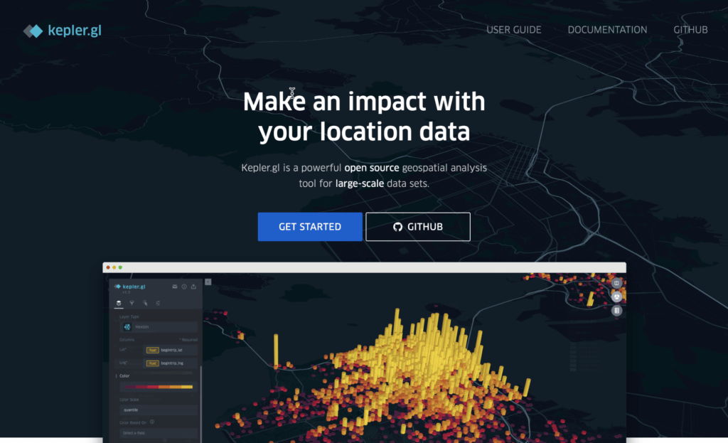
As our first step in visualizing Manhattan’s most dangerous traffic locations, we access the web-based Kepler.gl application by opening https://kepler.gl in a browser. Alternatively, we could install Kepler.gl locally by downloading the open source files on GitHub, but using the online version demonstrates how easy it is to create data visualizations.
Load speed data
The speed data, which we obtain from Uber Movement, contains a GeoJSON object defining street sections based on speed and the time of the day when the data was recorded. As an indicator of each street’s safety, the difference between the 95th percentile speed and 85th percentile speed (95/85 percent of the time the speed is equal to or less than this speed) is used. Streets with a speed difference of less than 10 mph are considered safe.
The data is stored as a comma separated value (CSV) file, and looks like this:
| sa.geojson | freeflow_speed | hour | speed_difference |
| {“type”:”LineString”,”coordinates”:[[-73.9907278,40.7559486],[-73.9878881,40.7547554]]} | 11.801242236024844 | 22:00 | 6.211180124223602 |
| {“type”:”LineString”,”coordinates”:[[-73.9947719,40.7699966],[-73.9948449,40.7697672],[-73.9949029,40.7696256],[-73.9950615,40.7693328]]} | 32.91925465838509 | 19:00 | 6.832298136645963 |
This data is collected anonymously and aggregated, so there is no trace back to individual drivers.
On the front page of Kepler.gl, clicking the Get Started button opens a dialog, where a data file can be loaded by either drag and drop or selected by clicking the browse your files link, as shown in Figure 2, below:
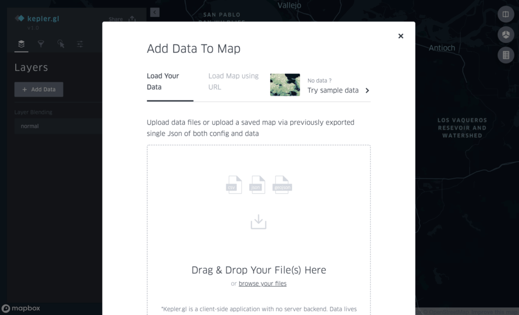
After loading our speed data file from Uber Movement, we can begin configuring the view.
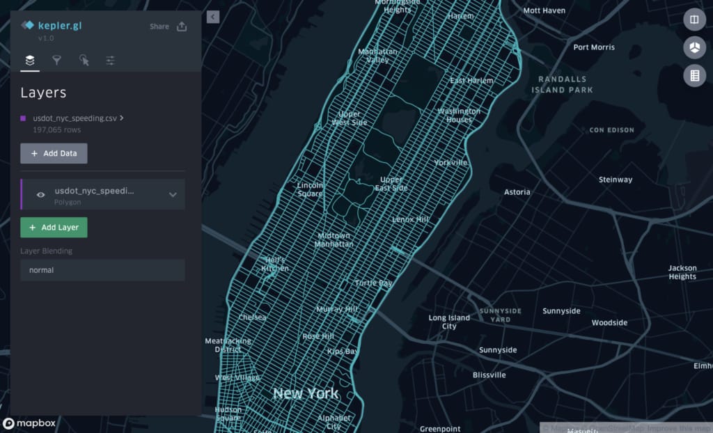
Configure the view
When the data is initially loaded, Kepler.gl treats all the road sections the same, displaying them with a single color, as shown in Figure 3, above. Since the data contains data to visualize speed differences, the street segments the color is set to be based on the speed difference column.
Using the Kepler.gl interface, we:
- Uncollapse the layer settings
- Uncollapse the color setting
- Select speed_difference in Color Based On
Kepler.gl offers a default color palette, although we can customize these colors for better visibility.
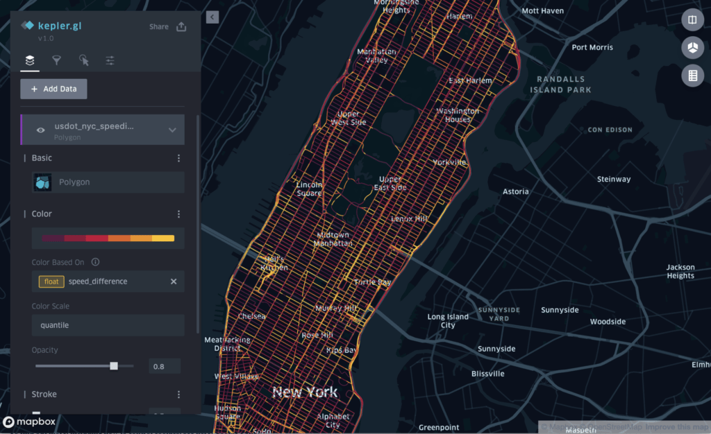
Specifying data on speed differences makes this data visible on our map of Manhattan, a first step towards visualizing traffic safety data.
The data also contains a timestamp, which means the speed difference can be evaluated based on the time of the day. The timestamp lets us add a playback feature, which lets us see changes over time as an animation. To add the playback animation, we need to add a filter, using the following procedure:
- Click the Filter icon.
- Click the Add Filter button.
- Select hour as the field.
The playback control is now added to the screen, as shown in Figure 5, below:
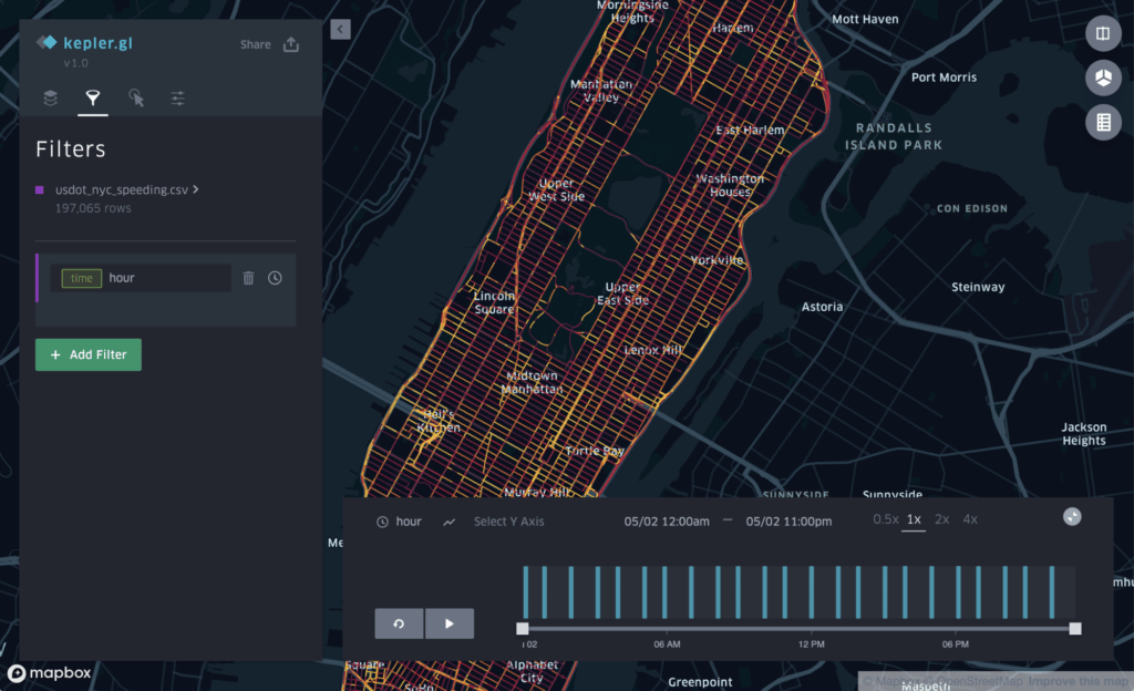
The Uber Movement speed data is now loaded and the visualization settings are done for this dataset.
Load crash data
For this next step, we load the publicly available datasets from NHTSA and the NYPD. The dataset from NHTSA contains crash fatality records, and the dataset from NYPD contains vehicle crash records.
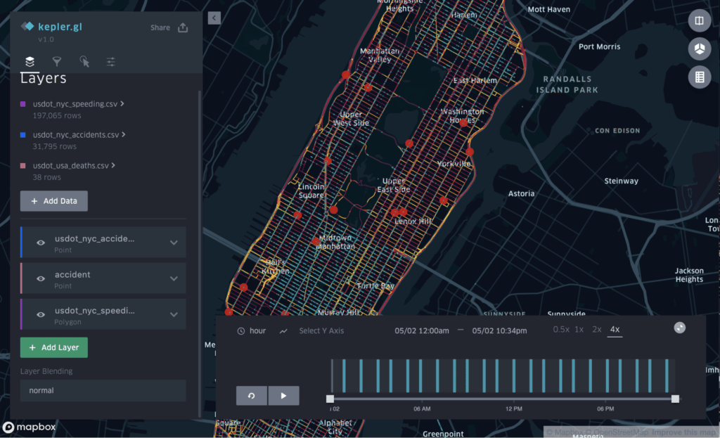
We load the datasets by clicking the Add Data button in the Layers menu, and then following the same procedure as when we loaded the speed data. After loading the data, Kepler.gl adds the two datasets as additional layers. One layer, illustrated with red dots in Figure # below, shows fatal crashes, and another layer, illustrated with blue dots, shows vehicle crashes.
Investigate
With all the data loaded, it’s now easy to get an overview of where the highest concentration of crashes occur, with or without fatality, as shown in Figure 6, above.
As mentioned at the start of this article, we want to investigate the street referred to as “Manhattan’s Boulevard of Death,” more specifically, the intersection between Canal Street and Bowery Street. If we zoom in on that specific intersection, the data supports the name.
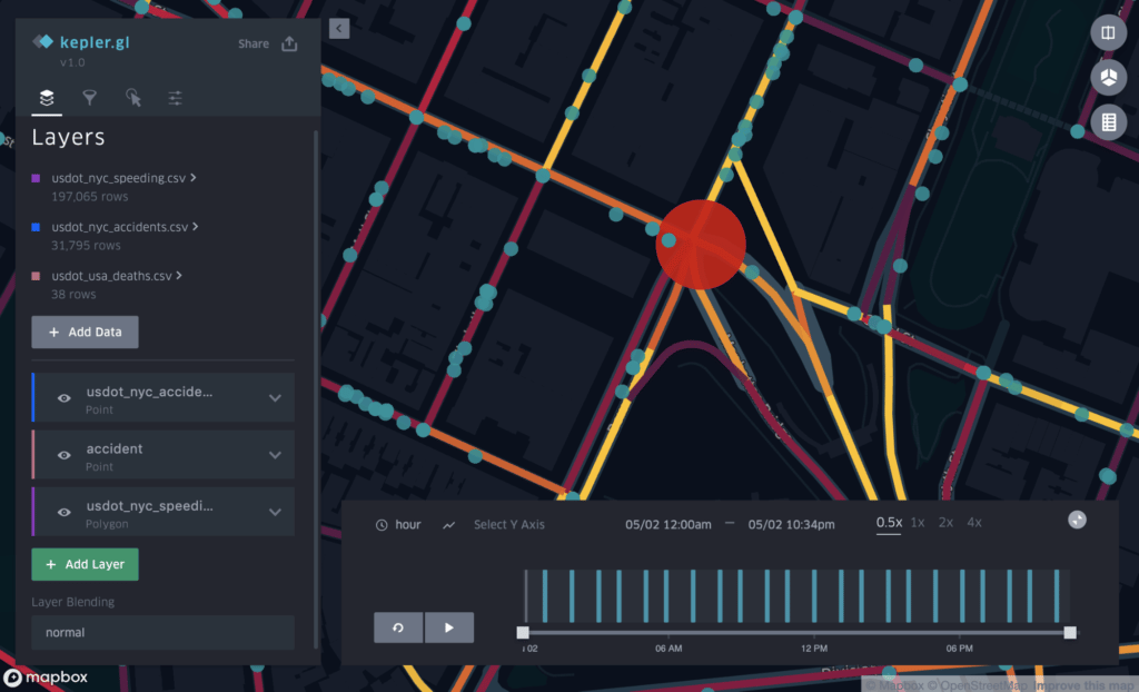
A red dot shows the location of fatal crashes, right in the intersection of Canal Street and Bowery Street. The coloring of the streets visualizes, as previously described, speeding behaviors.
We can use the time range slider to evaluate speeding behavior at different times of the day to gain insights about when the streets become more unsafe for traffic.
Try it yourself
The use case illustrated above is based on Uber Movement data, which is only available to government agencies. If you would like to try Kepler.gl for a simple exercise, you can follow this short guide below, which uses only publicly available data.
The city of San Francisco has hundreds of datasets available, covering everything from tree locations to transportation. In this exercise we use a dataset that contains landmark locations.
Kepler.gl can be used directly from a browser, without installation or creating user accounts, just as shown in the use case above. This makes it easy to try Kepler.gl and get familiar with visualizing geospatial data.
1. Get the data
In this quick walk-through, the objective is to show landmarks in San Francisco. The dataset with landmark coordinates and names is available on the DataSF website, and can be downloaded from this link.
The data looks like this:
| the_geom | OBJECTID | LMNO | Name |
| MULTIPOLYGON (((-122.440573525 37.731716381, -122.440711839 37.731715649, -122.440713234 37.731934272, -122.440574917 37.731934574, -122.440573525 37.731716381))) | 154 | 78 | Sunnyside Conservatory |
| MULTIPOLYGON (((-122.427201866 37.763824121, -122.4272296 37.764103529, -122.426541611 37.764142947, -122.42652189 37.763937175, -122.426825127 37.763886758, -122.426881817 37.763877333, -122.427201866 37.763824121))) | 169 | 1 | Mission Dolores |
| MULTIPOLYGON (((-122.454960515 37.771900069, -122.454830759 37.771960595, -122.454774695 37.771884863, -122.454568065 37.771981247, -122.454463754 37.771840342, -122.454800139 37.771683432, -122.454960515 37.771900069))) | 276 | 175 | McLaren Lodge |
2. Load the data
Follow the same process to load this data file into Kepler.gl as described above. First, open a browser, and go to the URL https://kepler.gl. Then click the Get Started button to open the dialog, and load the dataset using either by drag and drop or browsing your file system.
When the data is loaded, landmarks are populated on the map.
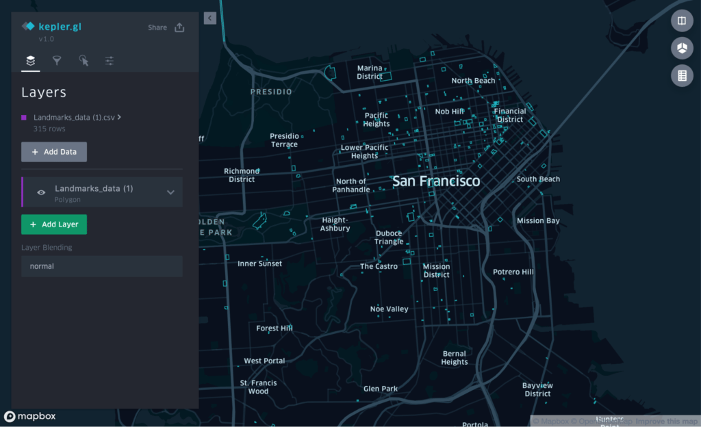
3. Customize
Kepler.gl outlines the landmarks in its default colors, but some of the smaller shapes can be hard to see when the map is zoomed out. To increase visibility, let’s change the color to orange and fill in the shapes.
To do this:
- Uncollapse the layer Landmark_data.
- In Color, click the default color and select orange.
- In Fill, enable fill.
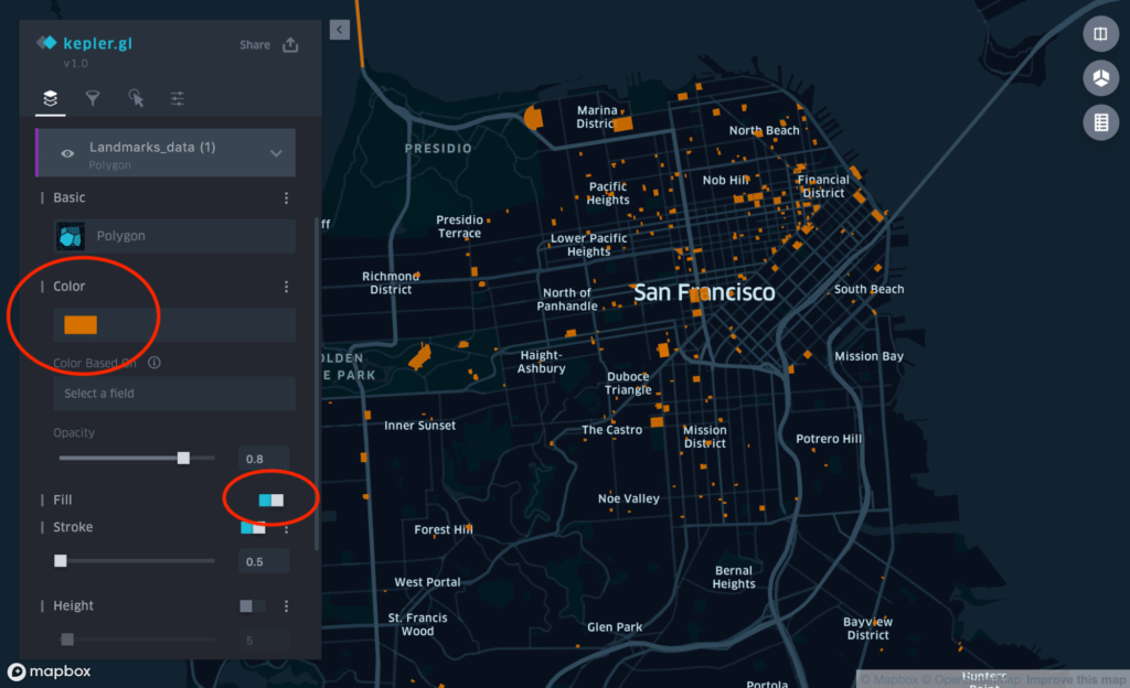
The landmark shapes are now easier to see in the map, as shown in Figure 9, above.
Want to learn more?
Kepler.gl can be used for a wide range of visualization tasks, including building dashboards. Kepler.gl gives you the opportunity to learn and become familiar with its rich set of features, even if you don’t have a specific dataset you want to use. The sample data, which is available from the data load dialog, is very useful to test and explore features.
We used the online version of Kepler.gl in the examples above, but you can also integrate Kepler.gl in your own project. See the User Guide, Documentation, or the GitHub repository for more information.
If you want to learn about all of Uber’s open source projects, check out our Github page, and, if you are interested in joining our team, visit the Uber Careers page.

Carsten Jacobsen
Carsten Jacobsen is an open source developer advocate at Uber.
Posted by Carsten Jacobsen