Engineering Intelligence Through Data Visualization at Uber
3 May 2016 / Global
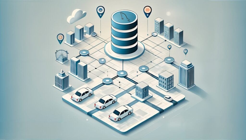
In early 2015 we started an official data visualization team at Uber. The idea behind it: deliver intelligence through crafting visual exploratory data analysis tools for Uber’s datasets. Every day, Uber manages billions of GPS locations. Every minute, our platform handles millions of mobile events. Every time we don’t use technology to analyze and interpret this information is an opportunity missed to better understand our business.
Since its inception, the data visualization team in Uber Engineering has grown from myself and one engineer to a fully stacked team of 15. The skills of data visualization specialists span from computer graphics to information design, covering creative technology and web platform development as well. Our team focuses on areas from visual analytics to mapping, and framework development to public-facing data visualizations.
Let’s see what each of these areas do through some of our work:
Visual Analytics: Making Data Actionable at Uber

Visual analytics mostly consists of abstract data visualizations. This refers to visualization work where the data has no inherent spatial structure. Opposed to this notion is scientific visualization, where visualization depicts data coming from the physical world (maps, 3D physical structures, etc.) Most visual analytics work in this case relates to reporting, dashboarding, and real-time analytics in charts and networks. Our team powers the visualization layers on most business insight applications and business data exploration. Other areas powered by our visualization work include our A/B testing platform and our internal, large-scale machine learning platform.
Our team enforces building reusable components as we create these applications. We recently open sourced react-vis, a React and D3-powered visualization library that provides a JSX-based, domain-specific language to compose charts from visual axes, chart types, and other basic visual elements. It empowers developers to declaratively shape the visualization they’d like to use with their dataset in a React- and JSX-friendly way.
We’re working on similar efforts for mapping.
Mapping: Rich Exploratory Data
Map-based information is one of our biggest and richest assets at Uber. The billions of GPS points handled by our platform every day in real-time pose atypical challenges for real-time mapping visualizations and in-browser, data-dense visualizations.

We develop multiple mapping applications tailored to different customers. One type of customer is the general managers and City Ops teams in the 400+ cities where Uber operates. These folks need to have in-the-moment information of the current supply and demand distribution. They might also need access to aggregated data to better understand the city’s market for a marketing campaign. Another customer is data science, which needs rich exploratory interfaces for multidimensional data (broken down by product, time, and geo). We build applications for them to slice and dice that information and get insights from our data.
Our tech stack for these applications consists on a few libraries that we developed and open sourced. react-map-gl provides a React-friendly layer on top of MapboxGL, a library from Mapbox that we use extensively at Uber. deck.gl provides an interface for creating WebGL-powered layers that can be put on top of a map or used standalone for creating abstract data visualizations.

But all this technology can be used in creative ways as well. A strong part of data visualization is visual storytelling and data art and illustration.
Public Facing: Data Storytelling
There are many creative ways to tell the story of Uber with data visualization. We can create visual narratives around topics like safety, efficiency, traffic, or Uber’s role in the public-transit network.
We recently created a data visualization that explores how uberPOOL can have an impact in making cities’ transportation much more efficient. Behind Travis Kalanick in his TED Talk, you’ll see the data visualization we crafted to show traffic per street segment with and without uberPOOL, demonstrating POOL’s ability to make cities smarter by reducing traffic.

We continue working on other visual narratives. This area of work has an interesting mix of data journalism paired with data art and illustration that creates challenges. Data handling is as challenging as the work we do for our internal visual exploratory data analysis products, but aesthetics plays an important role—the visual stimulation and human digestibility is often a bigger priority than effective information design techniques.
For example, we started collaborating with the design team to get branded videos for animated maps showing every car on trip with Uber for a full day, a day in the life of Uber. The result is a WebGL application that runs server-side rendering for each frame and compiles it into a video. The application takes care of everything from the data gathering process (through Hive) to constructing the video with offline rendering techniques.
A 3D immersive animated map shows a full day of anonymized Uber trips:
San Francisco
Los Angeles
For some of this work we also developed a framework called luma.gl, focused on WebGL-based visualizations. It has been designed with modern technologies in mind: ES6, WebGL 2.0, and a component-based platform. This makes luma.gl interoperable with other popular libraries like stack.gl.
Want to Learn More?
At Uber, data is our biggest asset. We generate insight by using data to create visual exploratory data analysis tools, but data exposition of our business metrics also enables managers in all of our cities to make informed decisions about the business. If you’re interested in taking on some these challenges with our team and Uber Engineering, check out our data viz engineering openings and reach out to data-viz@uber.com. We’d love to hear from you.
Like what you’re reading? Sign up for our newsletter for updates from the Uber Engineering blog.

Nicolas Garcia Belmonte
Nicolas Garcia Belmonte is Director of Engineering, Urban Computing and Visualization, at Uber.
Posted by Nicolas Garcia Belmonte
Related articles
Most popular

MySQL At Uber

Adopting Arm at Scale: Bootstrapping Infrastructure

Adopting Arm at Scale: Transitioning to a Multi-Architecture Environment


